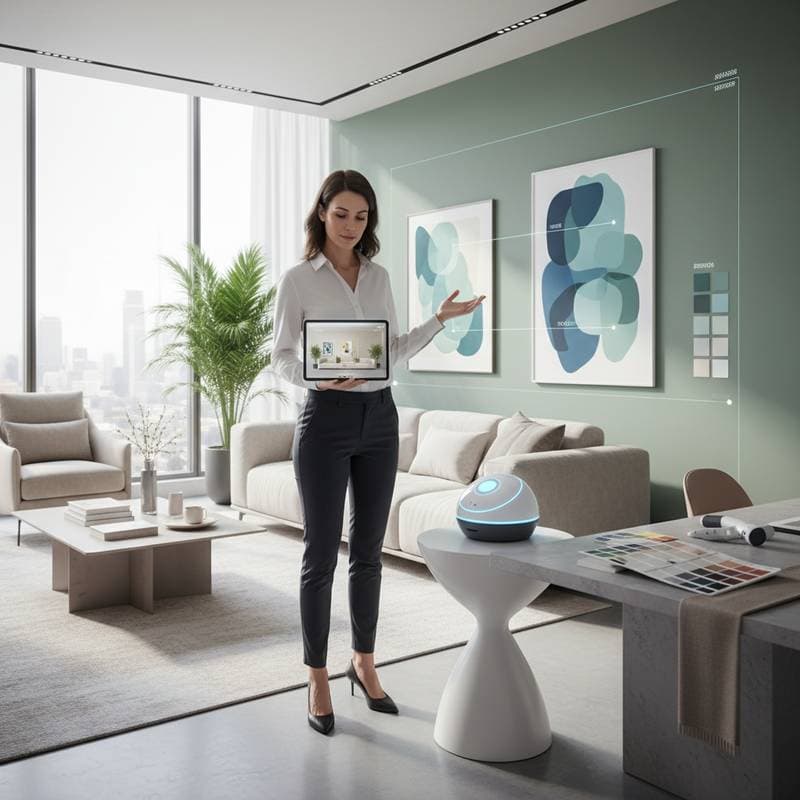
AI Tools Enhance Precision in Home Color Selection
Color selection remains a vital and challenging element of interior design. A well-chosen shade can elevate a compact room, temper strong lighting, or alter the atmosphere entirely. Designers have long depended on expertise and intuition to evaluate color interactions, undertones, and performance under varying light conditions. Digital AI tools now support this process, offering new ways to select, test, and coordinate colors for residential spaces.
Advanced AI color-matching platforms go beyond basic tone identification. They examine factors like light temperature, surface textures, and imaging inaccuracies to suggest accurate paint and fabric pairings. This approach fosters greater assurance and relies on data to reduce the risks in color decisions.
This article highlights five leading AI-powered color-matching tools that influence home interiors. Each tool emphasizes accuracy, ease of use, and sophisticated visual analysis.
5. PaintLab by Sherwin-Williams: Realistic Surface Previews
PaintLab allows homeowners to preview colors directly on actual surfaces. Through a smartphone camera, the tool captures walls and structural elements, then applies digital paint layers for a lifelike simulation of the outcome.
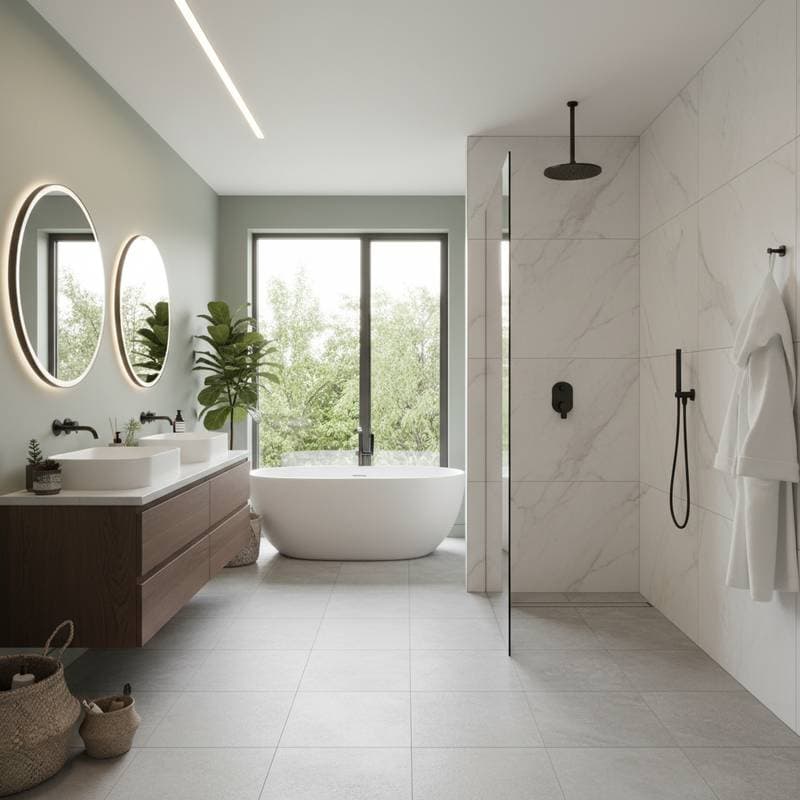
In contrast to basic overlay applications, PaintLab employs AI to account for depth, shadows, and material qualities. It differentiates between matte and glossy effects, so a color like Pure White SW 7005 displays true to form under natural daylight.
Architect Jonas Reeve of Reeve Atelier notes that this tool connects vision to execution. Clients preview nuanced pairings, such as Iron Ore cabinetry alongside Alabaster walls, well before applying any paint.
4. MatchPoint by Dunn-Edwards: Accurate Matching for Experts
MatchPoint functions as a professional-grade color scanner for designers and contractors. Its algorithm analyzes samples under standardized lighting and generates precise paint formulas to maintain uniformity in extensive projects.
In restoration or historic settings, exact replication proves essential. The tool converts a scanned piece of weathered plaster into a bespoke shade that replicates the source accurately. It adjusts for surface absorption and aging effects that alter perceived colors.
Elena Harrow, senior color technologist at Dunn-Edwards Paints, states that MatchPoint integrates scientific methods with traditional skills. Professionals benefit from its reliability, avoiding the need to match swatches across diverse lighting scenarios.
3. Chromatica: Mood-Informed Color Recommendations
Chromatica incorporates psychology into its color analysis. The AI processes reference images to identify emotional impacts of hue combinations, helping users create environments aligned with specific feelings rather than passing fashions.
For tranquility, it might suggest Silver Marlin, Cloud White, and Nimbus Gray. To inspire vitality, options could include Coral Gables or Tangerine Dream.
Developed with input from environmental psychologists and experts at Studio Miro, Chromatica ensures recommendations appeal visually while supporting emotional harmony. This method turns color choices into tailored experiences rooted in research.
2. NeoMatch: Adaptive Assistance for Personalized Design
NeoMatch evolves with user input, adapting to individual tastes. It reviews past color selections, preferred finishes, and room layouts to forecast suitable options with high precision.
Interior designer Clara Jensen of Atelier North values its adaptability. She observes that after several uses, it captures a user's distinctive style and aligns suggestions with both visual and functional needs.
NeoMatch connects to smart home devices for dynamic updates via light sensors. During variable weather, it demonstrates how paints might shift in appearance under current conditions.
This blend of customization and real-time data positions NeoMatch as a versatile resource for experts and hobbyists alike.
1. SpectrumComprehensive Color Simulation
Spectrum AI leads with its integrated system of scanning, forecasting, and immersive rendering. It evaluates physical samples, anticipates color changes over time, and visualizes full rooms in detailed 3D.
Unlike typical software, Spectrum AI recognizes textures precisely. It separates brushed brass from polished chrome, or silk from linen, and accounts for matte versus glossy interactions with light. These capabilities ensure colors convey realistic surface qualities.
Design technologist Ava Nouri of FrameWorks Studio highlights that Spectrum AI grasps light-texture dynamics, essential for authentic interior effects.
Users simulate long-term palette shifts, such as Graphite walls fading to Wrought Iron under sunlight. The platform models these evolutions with fidelity.
Spectrum AI unites intuitive design with analytical rigor, elevating the accuracy of color visualization.
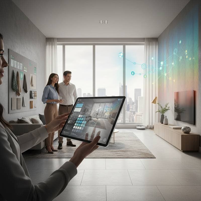
AI's Impact on Design Practices
AI color tools spark discussion among designers. Concerns arise about potential displacement of creative roles, yet many see them as valuable aids.
Architect Mila Davenport of Studio Meridian views the partnership positively. She points out that while AI handles vast data, it lacks insight into personal emotions or histories.
These tools remove routine uncertainties without diminishing originality. Designers gain time for ideation, narrative development, and client interactions.
For independent homeowners, AI democratizes advanced techniques. Users experiment freely, iterating on options before final selections.
Achieving Balanced Interiors Through Technology
AI enhances color decisions without supplanting human insight. Optimal results emerge from combining analytical tools with personal vision, yielding spaces that resonate intellectually and intuitively.
Homeowners preview effects like Simply White under midday light or Blue Note walls complementing oak floors. Such foresight builds assurance in transformations.
Professionals streamline consultations, minimize sample waste, and ensure reproducible results. As technology refines choices, design evolves toward greater harmony and expression.
Color transitions from subjective challenge to precise craft. Human discernment paired with digital accuracy crafts homes attuned to both reason and feeling.