Two-Tone Cabinets: Why Color Blocking Rules Kitchens
Every kitchen conveys a narrative through its palette, materials, and layout. The emergence of two-tone cabinetry expands creative possibilities for homeowners and designers. This method moves beyond uniform finishes to embrace contrast, balance, and subtle drama. The approach endures because it fosters personalized, layered spaces that blend individuality with lasting elegance.
The Visual Rhythm of Contrast
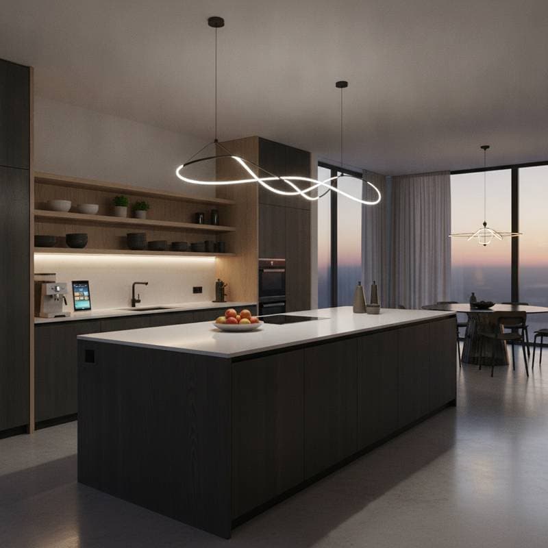
Two-tone kitchens establish a rhythmic flow. Designers often pair light upper cabinets with darker lower ones to guide the eye across the room. This contrast grounds the space while keeping it airy, satisfying the brain's preference for equilibrium.
Interior designer Sarah Richardson of Sarah Richardson Design calls this visual choreography. She recommends combining soft whites like Benjamin Moore’s Simply White with deep navy bases in Farrow & Ball’s Hague Blue. Lighter tones elevate the ceiling visually, while darker ones provide stability for overall harmony.
Drawing from Classic Craftsmanship
Two-tone cabinetry echoes historical European designs, where wood bases met painted uppers for practicality against wear and light. Modern iterations refine this tradition with precise layering of hues and finishes.
Architect Mark Cutler of CutlerSchulze emphasizes proportion in contemporary projects. He suggests darker lower cabinets in quarter-sawn oak for warmth alongside painted uppers in Sherwin-Williams Alabaster for freshness. This combination yields a refined, authentic feel.
Manipulating Space with Color
Color blocking alters perceptions of volume and light. Lighter shades recede to open areas, while darker ones advance to define boundaries.
In compact kitchens, apply pale upper cabinets in Farrow & Ball Pavilion Gray with graphite bases in Benjamin Moore Kendall Charcoal. This setup lifts ceilings and deepens corners, fostering vertical expansion. For larger spaces, invert the scheme to add coziness by weighting the upper areas.
Pairing Materials for Narrative Depth
Extend two-tone design beyond paint by mixing materials for tactile interest. Consider matte lacquer with brushed oak or powder-coated metal above honed marble.
Designer Leanne Ford of Leanne Ford Interiors favors raw and refined contrasts. She pairs bleached ash uppers with blackened steel lowers for an inviting, touchable quality. These textures turn cabinets into functional architectural elements.
Building Depth with Neutrals
Neutral palettes gain nuance through tonal variation. Layer creams, grays, and taupes for subtle character without bold risks.
Try Dunn-Edwards Whisper on uppers and Benjamin Moore Revere Pewter on bases for balanced warmth. Match undertones: cool grays with blues or greens, warm neutrals with oak or brass. Designer Nate Berkus notes that tonal shifts create sophisticated depth that remains comforting and versatile.
Incorporating Bold Colors Strategically
Bold hues shine in controlled two-tone applications. Pair deep emerald in Farrow & Ball Studio Green with crisp white uppers in Benjamin Moore Chantilly Lace for sculptural impact.
Architectural color specialist Justine Sterling of Justine Sterling Design advises testing saturation under varied lighting. Opt for high-gloss on darker tones to reflect light and maintain vibrancy. This method turns vibrant choices into enduring focal points.
Enhancing with Hardware and Finishes
Details like hardware and surfaces unify two-tone schemes. Brushed brass pulls connect walnut bases to ivory uppers, while matte black handles sharpen gray and white palettes.
Designer Heidi Caillier of Heidi Caillier Design views hardware as essential accents. Select shared metal finishes to harmonize colors. Consider countertop sheen and tile glaze to support the overall composition without rivalry.
Optimizing for Light Dynamics
Two-tone designs interact dynamically with illumination. Natural daylight accentuates hue shifts, while artificial sources build evening warmth.
Lighting designer David Warfel of Light Can Help You suggests layered setups: recessed ambient lights plus spots grazing cabinet faces. Undercabinet LEDs highlight transitions softly. This illumination animates the space across daily cycles.
Defining Zones for Functionality
Use color to delineate functional areas without walls. Darker tones frame cooking zones, lighter ones highlight prep or storage.
Designer Jean Stoffer of Jean Stoffer Design applies this in open layouts. A color shift subtly directs movement and organization. Such cues integrate beauty with everyday efficiency.
Capturing Emotional Resonance
Colors influence mood in gathering spaces like kitchens. Deep navy or forest green promotes calm, light shades foster clarity. Their pairing balances serenity and energy.
Interior stylist Emily Henderson urges selections that mirror personal traits. Two-tone options allow expression of grounded and playful elements. This depth ensures lasting appeal beyond trends.
Maintaining and Evolving Your Design
Two-tone cabinets adapt over time with minimal effort. Natural light fades woods and mattes gently; clean with non-abrasive products and touch up edges as needed.
Observe daily light patterns to appreciate shifts, like morning grain highlights on oak bases or evening depth in blue-gray uppers. For updates, change hardware, repaint uppers, or add new lights to refresh the mood without overhaul.
Personalizing for Lasting Appeal
Infuse soul through custom details like stained woods, brushed finishes, or accented shelving. Echo tones in accessories, textiles, or art for cohesion.
Incorporate open shelving in lighter hues for openness, or brass pendants to soften contrasts. Small additions, such as complementary vases, strengthen the palette's harmony.
Steps to Implement Two-Tone Cabinetry
Start by assessing light flow and key focal points like islands or range walls. Select authentic colors and durable materials that age well.
Consult designers or makers for balanced proportions; test samples in situ with countertops and floors. This deliberate process yields a kitchen rich in dialogue between tones, textures, and light, elevating it to a personal, expressive core of the home.