Fall 2025 Colors to Unify Your Open Plan Living Space
Why Color Defines Open Plan Design
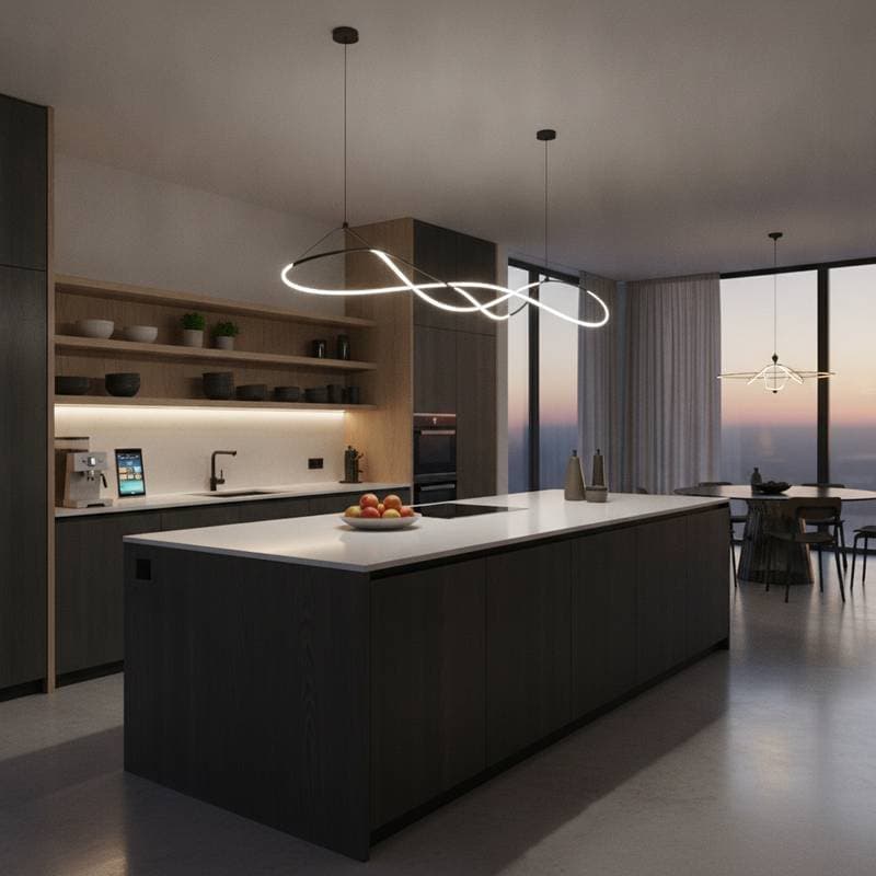
Open plan living continues to dominate modern home design, offering a sense of freedom and fluidity in new constructions, loft conversions, and remodels. Without walls to separate functions, the challenge lies in creating a cohesive, functional, and inviting space. Color emerges as the most powerful tool to address this, providing structure and warmth without physical barriers. For fall 2025, the palette of earthy neutrals, vibrant jewel tones, soothing pastels, and reflective metallics offers a versatile framework to balance openness with intimacy while adapting to light and daily use.
This guide explores the standout colors for fall 2025, practical applications for open plan layouts, proven zoning strategies, and actionable tips to bring your vision to life. Whether you are working with contractors or tackling a DIY project, these insights will help you craft a space that feels both curated and personal.
The Fall 2025 Color Palette
Warm Neutrals as a Foundation
Shades like Terracotta Clay (Pantone 18-1549), Caramel Cream, and Butterscotch Gold anchor the fall 2025 palette with their tactile, earth-inspired tones. These warm neutrals align with a growing preference for natural materials and sustainable finishes, creating a welcoming backdrop that performs well under varied lighting conditions. Apply terracotta or caramel to primary walls for a grounded base, and pair with light oak flooring to maintain an airy feel.
Design Tip: Paint main walls in a soft terracotta shade, then layer in lighter woods and fabrics to ensure the space remains bright and open.
Jewel Tones for Bold Depth
Rich hues such as Emerald Forest (Pantone 19-5718), Sapphire Night, and Amethyst Whisper add sophistication and visual weight to open plan spaces. These saturated accents, popularized by social media for their photogenic appeal, define specific zones like seating or dining areas without shrinking the perceived space. Use them sparingly to maintain balance and intentionality.
Design Tip: Highlight a single wall, sofa, or built-in cabinet with a jewel tone, offsetting it with muted neutrals to avoid overpowering the room.
Soft Pastels for Subtle Calm
Blush Pink (Pantone 13-1406), Mint Whisper, and Sky Blue Haze bring a wellness-focused serenity to multifunctional layouts. These tones reduce visual clutter and gently mark areas like a home office or reading nook without disrupting the overall flow. They work best as soft touches rather than dominant features.
Design Tip: Incorporate pastels through cushions, throws, or small rugs to create understated separation in shared spaces.
Metallic Finishes for Light and Elegance
Brushed Brass, Warm Copper, and Soft Gold Leaf introduce a crafted shimmer with low-VOC paints and finishes. These metallics reflect light, accentuating architectural details and lifting sight lines when used in moderation. They add a polished contrast to matte surfaces.
Design Tip: Apply metallic paint to trim, narrow vertical bands, or ceiling beams to enhance depth and highlight key features.
Color as a Space Planning Tool
Zoning Without Barriers
In open plan layouts, color replaces walls as the primary method for defining zones. A terracotta-toned living area can transition into a mint-hued dining nook, while a sapphire accent wall marks a workspace, all while preserving open sight lines. This relational approach ensures each area feels distinct yet connected, supporting both flow and function.
Adapting the 60-30-10 Rule
For large spaces, reinterpret the classic 60-30-10 color rule to maintain harmony. Allocate 60 percent to a dominant neutral like terracotta on walls and large furniture to keep the space expansive. Use 30 percent for a secondary tone, such as emerald on rugs or upholstery, and reserve 10 percent for accents like metallic decor or pastel accessories to add personality without fragmentation.
Light and Texture in Harmony
Light transforms color perception throughout the day, with cool pastels glowing in sunlit areas and warm neutrals energizing north-facing rooms. Pair matte wall finishes with textured fabrics like linen or wool, and contrast these with polished metals or subtly glossy tiles for a layered effect. High-CRI LED lighting ensures jewel tones render accurately, while dimmable warm white options shift the mood from day to night.
Actionable Ideas for Your Space
Paint and Surface Applications
Test paint samples on multiple walls, observing 12-inch squares at varying heights under different light conditions. Consider a warm gold metallic ceiling in lofty spaces to reflect light downward, or a narrow jewel-tone stripe near windows to visually extend low ceilings. Always compare samples against adjacent materials like wood or stone for cohesion.
Furniture and Fabric Choices
Opt for modular sofas in neutral tones, with interchangeable slipcovers in emerald or amethyst for seasonal updates. A solid caramel wood dining table paired with pastel velvet chairs offers luxury and comfort, while a sapphire office chair anchors a work zone without clashing with the broader palette.
Lighting and Decor Details
Layer lighting with recessed warm white fixtures and brushed brass pendants over dining areas to define separate moods. Add LED strips behind jewel-tone walls or shelving for evening drama. For decor, select large-scale art that ties together neutral, jewel, and pastel tones, and use terracotta pots or copper sculptures to echo the fall 2025 theme.
Bringing Your Vision to Life
Follow these steps to transform your open plan space with the fall 2025 palette:
- Map natural light patterns and high-traffic paths to inform color placement.
- Select a dominant neutral like terracotta for warmth or a pastel for lightness.
- Choose one jewel tone to anchor a key zone, such as a dining or seating area.
- Layer textiles like rugs and cushions in secondary and accent hues for depth.
- Introduce metallic touches through lighting or trim to unify the design.
- Test the scheme for a week, adjusting small elements before major commitments.
Crafting a Space That Endures
Color in open plan living serves as more than decoration; it organizes activity, shapes ambiance, and reflects personal style. Begin with subtle changes, such as a pastel rug or jewel-tone accent, then scale up to painted walls or architectural features as the balance feels right. Use the fall 2025 palette as a flexible guide, adapting it to your light, textures, and lifestyle for a space that feels both intentional and inviting.