Introduction to Autumn's Warm Embrace
Autumn arrives with a palette of colors that evoke comfort and change. These hues, inspired by falling leaves and harvest tones, transform interiors into sanctuaries of warmth. This guide presents five expert-selected combinations for 2025, each designed to suit various spaces and styles. Readers will find practical application tips, professional observations, and strategies to select and balance colors effectively.
1. Burnt Orange and Cream
Burnt orange captures the essence of autumn foliage, offering a vibrant yet grounded warmth. Paired with soft cream, it creates an airy balance that prevents the space from overwhelming. This duo suits living areas where natural light varies throughout the day.
How to use it:
- Paint walls in burnt orange and trim in cream for subtle contrast.
- Incorporate linen curtains and oak furniture to soften the vibrancy.
- Layer with neutral rugs to tie the scheme together without dominating.
Professional insight: I have applied this palette in family rooms to foster a welcoming environment. The cream tempers the orange's intensity, allowing the color to enhance rather than compete with daily activities.
2. Terracotta and Sage Green
Terracotta brings the rich, sun-baked earth tones of autumn, while sage green adds a fresh, herbal note. Together, they evoke a rustic serenity ideal for kitchens or reading nooks. This combination harmonizes with natural materials like stone or wood.
How to use it:
- Use terracotta for feature walls or upholstery, reserving sage for accents like pillows or artwork.
- Introduce clay pottery and linen textiles to reinforce the organic feel.
- Opt for matte finishes to maintain a understated elegance.
From the job site: In a recent project, this palette revitalized a sunroom, making it feel expansive yet intimate. Balance proves essential; excess terracotta can dominate, so sage provides necessary relief.
3. Cinnamon and Charcoal
Homeowners seeking a moodier, dramatic atmosphere find cinnamon and charcoal compelling. Cinnamon infuses warmth, and charcoal anchors the palette, avoiding an overly orange appearance. This pair excels in spaces requiring focus, such as studies or lounges.
How to use it:
- Apply charcoal to trim, doors, or lower walls, with cinnamon or rust tones on upper surfaces.
- Incorporate leather upholstery and metal accents to amplify the richness.
- Select warm white lighting to reveal the colors' depth.
Professional insight: I have employed this palette in dining rooms and home offices for clients desiring sophistication and intimacy. The interplay of dark and warm elements generates visual intrigue without relying on elaborate decorations.
4. Mustard and Navy
Mustard yellow radiates the glow of autumn sunsets, complemented by navy for a nautical depth. This versatile pairing works in bedrooms or hallways, bridging casual and refined aesthetics. It adapts well to both vintage and minimalist designs.
How to use it:
- Paint larger areas in navy, using mustard for accents like shelving or rugs.
- Add brass hardware and wool throws to heighten the cozy factor.
- Maintain light floors to counteract the navy's weight.
Professional insight: This combination has proven effective in transitional spaces, where flow matters. Navy provides structure, while mustard injects energy, creating a dynamic yet harmonious entryway.
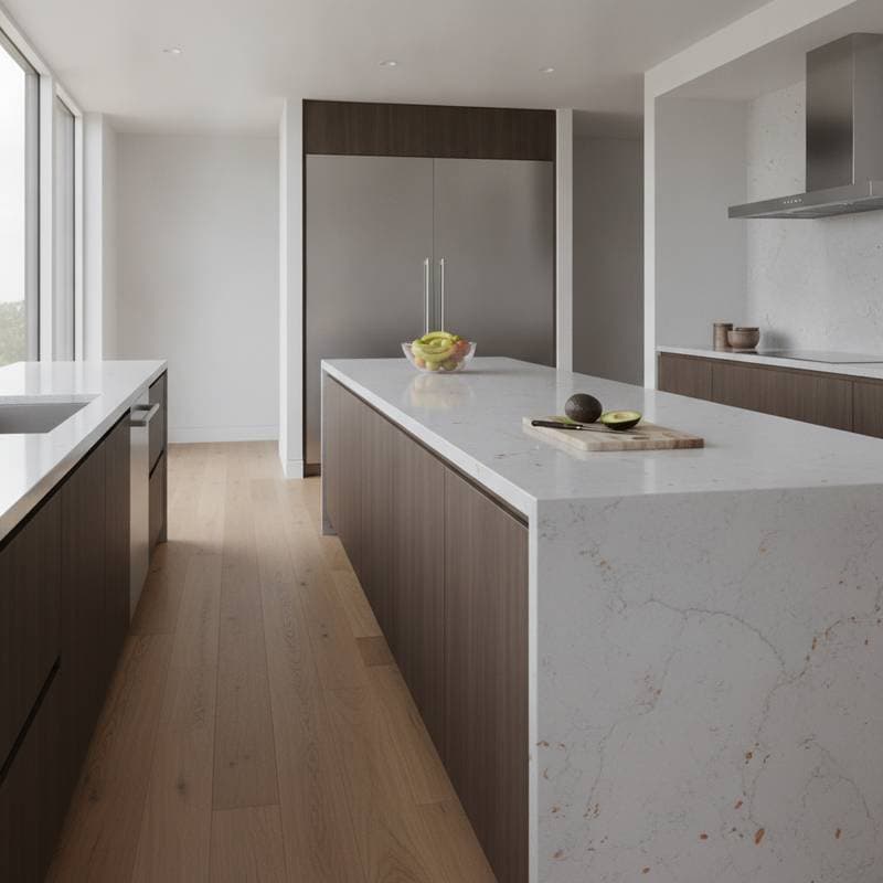
5. Copper and Forest Green
For those drawn to nature's palette, copper and forest green offer an authentic connection. Copper catches light with subtle sheen, and forest green imparts depth and calm. The result echoes autumn's foliage without direct imitation, fitting for bathrooms or entryways.
How to use it:
- Apply forest green to cabinetry or built-ins, accented by copper hardware or fixtures.
- Integrate woven baskets, wooden pieces, and neutral fabrics to temper the intensity.
- Choose white or off-white for ceilings and trim to avoid enclosure.
From the job site: I have witnessed this palette renew outdated kitchens into elegant retreats. Restraint guides success; excessive copper risks garishness, and overabundant green may darken the room. Equilibrium elevates the design.
Selecting the Ideal Palette for Your Space
Each residence possesses unique traits, and the chosen colors must amplify them. Follow this step-by-step approach to guide decisions:
- Evaluate lighting conditions. Ample natural light supports bold, deep shades; subdued areas favor lighter, warmer options.
- Examine permanent elements. Consider flooring, countertops, and cabinetry, as their undertones influence compatible hues.
- Establish an anchor color. Select one primary shade to define the mood, then layer complementary tones.
- Test samples thoroughly. Apply broad swatches across walls and observe them in morning, afternoon, and evening light to prevent errors.
- Foster cohesion through variation. Ensure adjacent rooms connect via palette echoes, yet differ enough to avoid monotony.
Professional tip: Limit selections to three to five colors overall. Exceeding this often leads to chaos, unless a professional coordinates the elements.
Integrating Warmth with Contemporary Design
A common worry involves autumn tones appearing dated. In reality, these colors achieve modernity through thoughtful contrast and scale. Focus on these techniques for fresh results.
For contemporary applications:
- Combine warm shades with sleek, linear furniture.
- Employ black or graphite details for sharp definition.
- Preserve open surfaces to allow colors prominence.
For traditional interpretations:
- Weave in patterns such as herringbone or plaid via fabrics.
- Select patinated metals or heirloom-inspired lamps.
- Stack variations within the color family for layered dimension.
Personal style should dictate the direction, ensuring the home endures beyond trends. Strategic planning renders warm palettes adaptable across aesthetics.
Sustaining Cozy Interiors Beyond Autumn
Autumn hues instill tranquility and solace, positioning the home as a true haven. Whether updating a single wall or overhauling multiple areas, thoughtful color choices yield lasting appeal.
Align selections with existing light, materials, and structure to craft purposeful environments. Prioritize not fleeting seasonal motifs, but the enduring warmth and connection autumn symbolizes.
Through precise hue choices, balanced illumination, and textural awareness, interiors remain welcoming across seasons.